
LIVN investment
The Livn logo is built around the idea of “living within opportunity.” The name Livn comes from Live In, representing a brand that helps people truly live in the spaces they invest in. The handwritten style of the Livn wordmark creates a human and approachable feeling, reinforcing that investment is not only financial but also personal and lifestyle-driven. The extended “L” base line acts as a structural foundation, symbolizing stability and the ground on which investments are built. By placing “ivn” visually on the L, the design communicates that every opportunity offered by Livn is supported by a strong foundation of trust and reliability.





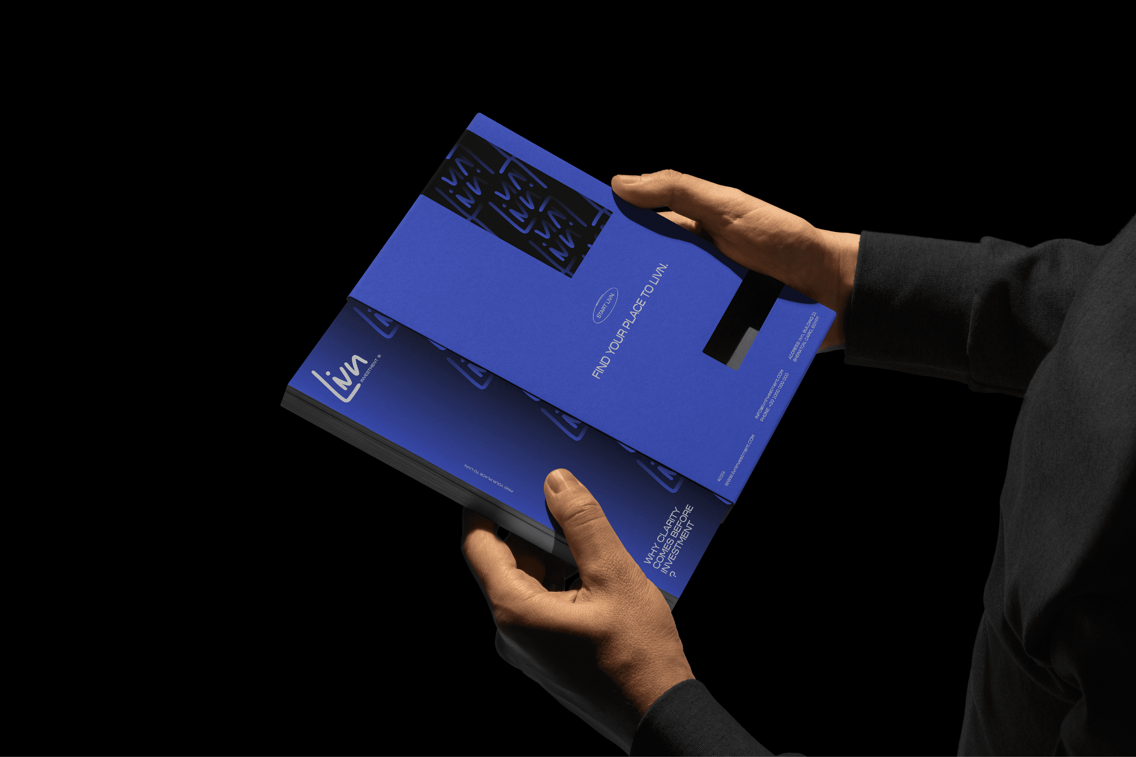


LIVN compresses Live In: a real estate investment brand that backs the spaces people inhabit. The handwritten wordmark keeps it human; the extended L base line does the authority work, a foundation the letters and the brand promise both rest on.
The system extends from the wordmark into LIVN's wider visual language for print and digital.